


Article
How to Add Editable Areas to Exported MailChimp Templates

Aug 15, 20142 min Read
Continue Reading

In the first installment of our Google Data Studio series, we covered the importance of setting goals for your report and how to frame your narrative. Outlining this narrative through your reports is key. With the amount of data available to marketers, it’s easy to get lost in the details without finding clear, actionable insights. However, your clients don’t want to spend several hours deciphering all the metrics you’ve provided them—they trust you to translate the marketing data into a story.
Google Data Studio provides some of the best tools to quickly give a visual report that illustrates your narrative. As you begin to look at different Data Studio templates and reports, you’ll notice the heavy influence of graphs and visual data. Google Data Studio offers over 30 types of charts and graphs to display your data. This variety allows marketers to quickly select and create the best graphic to narrate their story—providing a clearer picture of the data to clients. While the same types of graphs could be made in Excel, Google Data Studio allows you to quickly create theme-styled graphs and compile them into a dashboard.
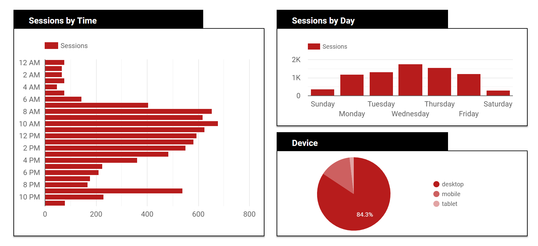
Of all the features included in Data Studio, the favorite and most useful is the data refreshing. Rather than exporting your Google Analytics data into a spreadsheet and manually creating graphs on a weekly or monthly basis, Google Data Studio will automatically pull your data into your dashboard as it’s updated in Google Analytics or Google Search Console. By inserting a time range widget into your Data Studio report you can dynamically update the time period your graphics display.
This magic tool is the best option for providing clients with dashboards—they can explore their data for any given time period without waiting on a marketer to send a report. This increases the amount of transparency between a marketer and client and significantly reduces the amount of time spent creating reports each month. You can spend a couple hours setting up your initial marketing dashboard in Data Studio and simply share a live link with your client or team members—no additional emails or PDFs needed. Then you can spend more time analyzing data and working on marketing initiatives instead of creating and explaining reports.
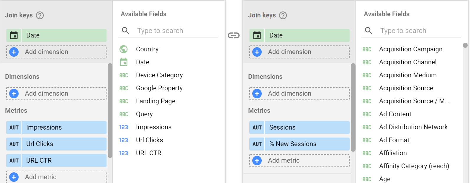
Another common headache for creating monthly reports is pulling and combining all your data from multiple sources. Google Data Studio solves this problem through the data blending tools. Within one Data Studio report, you’re able to add multiple data sources to compare and combine. By default, you can add your Google Analytics, Google Search Console, and Google Ads data, along with a few other sources. These integrations are called Google Data Studio connectors, and Google does provide many connectors for their own data sources. If you also need to pull data from your social media accounts, Google My Business profile, or email marketing service, you can use a paid connector tool and provide reporting for all channels in one place.
After adding all your data sources into your report, you can easily create graphs with each different data source. You can also blend your data sources, or use multiple data sources within one chart, to gain even deeper insights from your marketing data. Data blending is perfect for times when you want to track metrics across multiple data sources, as long as they have at least one dimension in common. Google Data Studio will use this commonality (called a join key) to match up the metrics from multiple sources into one source. This feature is vital if you want to look across data sources in a single clean visual, such as comparing ad impressions across different channels by date.
Google Data Studio’s simple and quick data visualization tools make it a natural fit for most marketing reporting. But Google’s sharing and collaboration abilities make this tool even better. As marketing becomes increasingly cross-functional between advertising teams, SEO teams, and content teams, Data Studio allows each team to have read and/or edit capabilities within reports. Each team member can work on their portion of a dashboard or review on an ongoing basis. In the same way that the live-sharing with clients increases transparency, this ability to collaborate internally on your reports keeps your team on the same page and tracking their efforts together.
Perrill is a full-service web design, development, and digital marketing agency that specializes in helping businesses reach their full potential online. Our team is experienced in leading new marketing initiatives for clients and in providing actionable data to drive improvement. Contact us today to start doing business online the right way.


